CRO & Experimentation
Website Redesign Tips and Checklist to Revamp Your Site
Revamp your site with our website redesign tips. Set clear goals, prioritize user experience, and optimize for SEO. Start your redesign now!

Gaurav Rawat


A study by Baymard Institute found that the average eCommerce website loses nearly 70.19% of potential customers at checkout, a number that shows how fragile the digital buying journey really is. For high-growth eCommerce and DTC brands, every missed click leads to lost revenue. Many marketing teams feel trapped between rising acquisition costs and stagnant conversion rates.
What happens when ads bring traffic, but the website itself turns visitors away? The frustration builds, especially when every redesign feels like a gamble instead of a growth opportunity. Across retail, fashion, grocery delivery, and beauty, shoppers now expect faster, simpler, and more reliable online experiences. They want a reason to stay, explore, and buy.
This blog shares actionable website revamp tips and a complete checklist to help you redesign your site for stronger conversions, smoother user journeys, and long-term growth.
Key Takeaways
Preserving URL structures, metadata, and redirects ensures that redesign efforts enhance visibility rather than dilute organic traffic performance.
Product pages, carts, and checkout flows should always take top priority in redesign cycles as they directly influence sales, AOV, and repeat buyer behavior.
Metrics like LCP, CLS, and INP now affect both Google rankings and user satisfaction, making technical optimization central to redesign success.
Refreshes improve aesthetics, while full redesigns rebuild architecture for personalization, omnichannel readiness, and long-term growth resilience.
Evaluate redesign success by tracking AOV, LTV, and retention, ensuring that design changes deliver lasting value, not just short-term performance spikes.
Why Does Your eCommerce Website Need a Redesign in 2025?
Even when acquisition costs are high and your ads are driving traffic, a conversion rate stuck at 2% to 4% means you’re leaving millions on the table. The 2025 benchmarks show the average eCommerce store converts between 2% and 4% of visits into sales, depending on the vertical.
With your brand spending heavily on paid traffic and seeing post-click drop-off, that gap becomes even more painful, where repeat purchase and Average Order Value (AOV) matter deeply.
Below are critical reasons your website may require a full overhaul.
Poor Conversion Benchmarks Across Devices: For mobile-first traffic (often over 70% of your paid visitors), conversion rates hover around 2.9% compared to about 4.8% on desktop, according to 2025 data. That means mobile visitors are converting at nearly half the rate of desktop. If your mobile UX is lagging, you are under-capitalizing on your growth investment.
Performance and Load Time Failures Impact Revenue: Studies indicate that pages loading in one second convert at 2.5 times the rate of pages that load in five seconds. For your high-traffic paid channels, this means every extra second of lag is eroding acquisition cost efficiency and reducing customer lifetime value (LTV).
Outdated Experience Doesn’t Support Modern Expectations: Even if your site structure hasn’t changed for years, newer shoppers expect frictionless flows, instant search, and smarter product discovery. If your site still uses legacy navigation or generic funnels, you’re creating unnecessary friction when your competitors are raising the bar.
High Post-Click Drop Off Indicates UX Gaps, Not Traffic Gaps: When you’re achieving traffic but see huge bounce or abandonment from product listing to checkout, the problem is the experience, not the acquisition. With your heavy spend on paid media, a website revamp gives you the ability to protect that investment and improve return on ad spend (ROAS).
Brand Trust And Repeat Buyers Depend On Experience: In fashion, beauty and personal care, where brand affinity drives repeat purchasing, a clunky checkout or unresponsive site chips away at loyalty. A redesign can build the emotional and functional trust that leads to higher AOV and longer-term customer value.
Also Read: Understanding the Difference between Customer Acquisition Cost vs Lifetime Value
A well-designed site today can quickly feel outdated tomorrow as buyer expectations evolve faster than design cycles. That’s why understanding how often to redesign your eCommerce website becomes just as important as knowing why you need it in the first place.
How Often Should You Redesign Your eCommerce Website?
Many growth-oriented eCommerce teams feel the pressure when every dollar of paid acquisition must perform; yet the website feels stuck. If your brand in grocery delivery, fashion, retail or beauty holds steady traffic but sees conversion lag, the timing of a redesign becomes a strategic decision.
When the industry is shifting rapidly with mobile-first, immersive experiences and tighter performance thresholds, staying on the same template for too long quietly erodes your competitive edge.
Below are key signals and timing benchmarks to help determine the right moment for your redesign.
Significant Drop In Mobile Conversion Rates: If your mobile conversion rate falls behind desktop by more than 30%, it often signals that your site’s architecture or UX no longer meets modern device expectations. For a fashion and apparel brand with heavy social traffic, this gap means wasted ad spend and lost growth potential.
Core Web Vitals or Performance Metrics Consistently Under Thresholds: Every extra second of page load reduces conversions by up to 20%. A redesign every 2–3 years helps incorporate updated frameworks and speed optimizations that older sites can’t handle.
Visitor Behavior Patterns Show New Entry Paths Or Channels: When you drive traffic from newer sources (for example, shoppable video in beauty or mobile-first grocery delivery traffic) and the current site fails to convert clicks from those sources, it’s a signal your site needs a structural redesign rather than surface-level updates.
Brand Expectations or Product Mix Has Evolved: If your offering has expanded (e.g., personal care moving into subscriptions, or a retail brand launching DTC bundles) and your website still resembles a legacy eCommerce catalog, the misalignment can hurt lifetime value. A 24-36-month redesign cadence allows your site to reflect evolving business models.
Also Read: 10 Best Practices and Tips for a Website's Hero Section
These benchmarks show you when staying with the current design becomes a liability, not just an option. Now that you understand when to redesign, let’s explore how to set goals that truly drive measurable eCommerce growth.
How Do You Set Redesign Goals That Actually Drive Growth?
Even when your brand is capturing high volumes of traffic, simply redesigning your site without clear and meaningful goals can lead to wasted budget and missed opportunities. Defining the right objectives means you can directly link your redesign to measurable gains in conversion rate, average order value and lifetime customer value.
Here are the key goal categories and how to apply them:
Increase Conversion Rate On Mobile Paid Traffic: With over 60% of paid clicks arriving via mobile devices, setting a goal to improve mobile conversion rate by, for example, 20% within six months gives your growth team a clear focus.
Raise Average Order Value Through Modular Upsell Flows: Rather than just increasing conversion count, define a goal like “Improve AOV by 15% by Q4 by offering bundled options on the product page.” An apparel brand could prompt curated accessory packs; a personal-care line might add subscription incentives.
Extend Customer Lifetime Value Via Post-Purchase Journeys: Set a goal such as “Increase repeat purchase rate by 12% within 12 months.” For DTC fashion, this might involve redesigning the “thank you” page to offer membership upsell; for retail, it could entail integrating loyalty-points display before checkout.
Preserve Technical SEO Equity While Redesigning With Performance Gains: A goal might be “Maintain current organic sessions while reducing average page load time to under 2 seconds.” Given that slower load times can reduce conversions, this goal links business risk and performance uplift directly.

Setting the right goals defines the why behind your redesign, but execution turns that intent into measurable impact. Now that your objectives are clear, let’s move to the top 10 website revamp tips that convert strategy into real eCommerce growth.
Top 10 Website Redesign Tips for eCommerce Growth
A high-performing eCommerce redesign is less about colors and more about how every interaction reduces friction and builds intent. When your brand invests heavily in acquisition, the website becomes the silent salesperson that decides whether visitors buy or bounce. Modern redesigns are grounded in behavioral science, UX intelligence, and continuous experimentation, not aesthetic guesswork.
Below are ten actionable website revamp tips proven to drive sustainable eCommerce growth.
Tip 1: Design for Predictive Intent Paths
When your acquisition spend is high but post-click drop-off or cart abandonment persists, your website may be missing the real intent behind a visitor’s click. Predictive analytics now help brands anticipate not just what a visitor will browse, but why they’re here, enabling smoother journeys and fewer abandoned carts.
For example, a beauty brand can detect early whether a visitor seeks an “everyday cleanser” or a “fast-acting blemish treatment,” tailoring navigation and CTAs accordingly.
Here are the strategic steps:
Analyze Early Behavioral Signals: AI-driven platforms now extract behavioral embeddings from first two-page visits to forecast purchase intent. For a fashion retailer, this might mean recognizing “accessory add-on intent” without a cart add-on yet.
Route Visitors Through Custom Experience Segments: Suppose a grocery delivery brand detects a visitor coming after a promo click for “week-night meal kit.” The site can pre-select bundle recommendations and minimise checkout steps accordingly, improving CVR.
Embed Triggered UX Based On Predicted Purpose: For a beauty site anticipating “routine renewal intent,” dynamically show subscription offers in the first fold rather than generic promos, aligning the flow with predicted repurchase rather than first-time trial.
Measure And Iterate On Intent-Conversion Alignment: When predictive routing is implemented, track not just conversion rate but “intent-to-action” time: how long between identifying predicted intent and checkout. Shorter durations mean less friction and higher ROI.
Example: Stitch Fix uses AI with human stylists to predict each shopper’s intent from their past purchases, feedback, and return patterns, recommending items they’re most likely to keep. This intent-first personalization increased customer satisfaction by 75%, boosted repeat purchases by 40%, and reduced overstocking. This proves how predictive intent design transforms behavior data into seamless, conversion-ready shopping experiences.
Also Read: Understanding and Designing for User Experience (UX)
Tip 2: Use Micro-Personalization Instead of Static Segmentation
Your site’s visitors may fall under broad segments like “fashion enthusiasts” or “beauty loyalists,” but real-time product recommendation systems driven by micro-personas deliver far stronger conversions. By analyzing live behavior, these models surface hyper-relevant products in the moment—turning passive browsing into intent-driven purchasing.
For brands operating in grocery, apparel, retail or beauty, refining content per visitor rather than broad groups can shift leakage points after paid traffic.
Here are the refined tactics:
Create Real-Time Contextual Personalization Triggers: For instance, a retail visitor arriving via a “summer clearance” ad shows one layout while a first-time visitor from a “new arrivals” email sees another; this differentiation removes generic UX errors and increases relevance.
Adapt Product Pages Based On Short-Term Signals: A beauty visitor who spent over five seconds on “sensitive skin” content triggers prioritized products for that concern rather than the default hero. That kind of micro-shift boosts AOV and reduces bounce.
Offer Adaptive Bundles Based On Historic And In-Session Behavior: A grocery subscriber repeatedly buying snacks but browsing fresh produce triggers a custom bundle for healthy snacks; this drives incremental revenue through relevant cross-sell rather than generic offers.
Monitor Personalization Impact Through Post-Click Cohorts: Track cohorts by personalized layout variant and compare AOV, repeat rate, and LTV. If one micro-segment shows disproportionate post-click drop-off, refine the personalization funnel rather than only the ad funnel.
Example: Nykaa achieved a 43.5% uplift in click-throughs via personalization of product recommendations and email triggers. This shows how customizing content per user behaviour drives engagement.

Tip 3: Prioritize Scroll-Depth Triggers Over Hero Banners
When visitors come from high-intensity paid channels (such as performance ads), the first fold only tells part of the story. The scroll depth (how far a visitor moves down the page) correlates with purchase intention far more than standard hero banner clicks.
Here are the refined tactics to prioritize scroll-depth triggers:
Use Mid-Page Triggered CTAs After Predictable Scroll Points: For example, a fashion brand sees that 60% of visitors scroll past 45% before clicking; placing “Shop the Look” CTA at that depth captures higher intent than a static hero.
Dynamically Swap Content Based On Scroll Engagement: A beauty visitor who scrolls into ingredient breakdowns signals high discernment and might be shown a “3-step routine bundle” instead of the hero “Top Seller” spotlight.
Track Scroll-Depth Conversion Rates And Use Them For Redesign Decisions: For grocery brands, if users scroll into “meal kits under 20 mins” then drop off, redesign that section to load faster and surface earlier; the metric moves from first-fold to full-page behavior.
Tip 4: Integrate Commerce and Community in Product Pages
Your website doesn’t just sell, it builds a relationship between your brand and the audience you’ve accumulated through paid traffic, organic reach, and retention efforts. When your product pages include a community layer, such as user-generated content, real-time reviews, and micro-forums, they become living environments that build trust, increase average order value, and improve lifetime engagement.
Here are the methods to integrate commerce and community in product pages:
Embed Real-Time Social Proof Widgets: Show the latest purchases by similar customers along with live ratings just beneath the product header. That real-time visibility signals authenticity and reduces hesitation for first-time buyers.
Enable Shopper Questions And Peer Answers On PDPs: A fashion brand might present a “What size did you pick and why?” section under each item so visitors see peer context immediately, improving sizing confidence and reducing returns.
Host Mini-Community Boards Embedded In Related Products: For a grocery or delivery service offering meal kits, embed a recipe exchange or photo feed of customers using the kit. This connection shifts the page from mere commerce to belonging, which strengthens brand affinity.
Use Community Cues To Cross-Sell Without Being Pushy: On a retail site, when a user scrolls to accessories for a main product and sees “30 other customers bought this combo,” the social proof becomes the cross-sell trigger rather than a generic upsell pop-up.
Gather Post-Purchase Content For Continuous Feedback Loop: Ask customers to share how they use the item and surface that content on live pages so new visitors see authentic use-cases and your site continually refreshes with real community-driven content.
Example: Many e-commerce platforms like Nykaa or Myntra blend tutorials, user reviews and peer Q&A on product pages, turning “just commerce” into community-driven decisions.
Also Read: Effective Psychological Triggers for Customer Engagement That Drive Results
Tip 5: Adopt Adaptive PDP Layouts Based on Traffic Source

Your acquisition channels, from paid Meta or performance ads to organic search, deliver visitors with differing intents and behavior patterns. Tailoring the Product Detail Page (PDP) layout based on the referral source allows your site to match those patterns rather than using a one-size-fits-all layout.
Here are the patterns for adaptive PDP layouts:
Customize PDP For Paid Social Clicks With Minimal Distraction: A fashion brand that directs traffic from Instagram should present a single prominent product image, headline benefit, and prominent “Add to Cart” CTA immediately, since social traffic often converts fast.
Tailor PDP For Organic Search With Depth And Detail: A beauty brand receiving visitors from educational blog articles should display detailed ingredient sections, comparison tables and credible endorsements because that audience is in a research mindset.
Optimize PDP For Retargeting Traffic With Reminder Cues: For retail visitors returning via remarketing, show previously viewed items at the top, recent price changes, and limited-time offer badges to nudge action rather than requiring full exploration again.
Adjust Layout For Meal-Kit Grocery Channels With Bundle Emphasis: When traffic originates from a grocery subscription ad, present the bundle configuration interface high on the page, emphasize easy reorder logic and show delivery frequency options upfront.
Use Analytics To Iterate PDP Variants Based On Source Behavior: Monitor conversion rates by source and layout combination across time, and shift heavier layouts for sources with longer sessions accordingly. This helps you refine which layout types truly drive AOV by channel.
Tip 6: Replace Generic Filters With Conversational Product Search
Standard filter panels often fail to match the natural language or intent of high-growth audience segments. As shoppers increasingly use search bars or voice-style queries like “comfortable denim for tall women under $100”, your redesign must treat search as primary, not optional.
Here are the levers:
Enable Natural-Language Query Input on PLPs: A fashion brand should allow queries like “sustainable sneakers size 10” rather than forcing checkbox filters only; this meets how your visitors speak, reducing frustration.
Offer Guided Conversational Prompts Based On Common Shopper Questions: For a beauty site, when a visitor starts typing “anti-aging serum for dry skin”, the interface suggests “serum + moisturiser combo” or “free skin-diagnosis quiz”, aligning with their actual need rather than a default product list.
Show Dynamic Results Without Page Reloads To Keep Momentum: For a grocery delivery business, let the search results update live as users type “quick dinners for two”, keeping engagement rate high and funnel time short.
Track Search Query Drop-Offs To Identify Design Weaknesses: Monitor when users abandon after typing a search; if a pattern emerges in a retail brand for “plus-size workwear”, redesign the search results page to emphasize relevant inventory rather than generic fall-back.
Tip 7: Build Trust Clusters Near High-Friction CTAs
Every checkout hesitation has a root cause: doubt. Visitors question product quality, delivery reliability, return flexibility, or payment safety right before committing. A trust cluster is the strategic placement of social, security, and reassurance cues directly around CTAs where uncertainty peaks.
For brands converting paid traffic, the shift from generic reassurance to context-specific trust becomes essential.
Here are the methods to build trust clusters:
Surround Checkout Buttons With Multi-Layered Assurance Signals: A fashion brand can add real customer snapshots, satisfaction guarantees, and payment safety badges right around “Place Order.” These visual reinforcements reduce last-second abandonment.
Use Proximity-Based Trust Proof For Subscription Offers: For a beauty brand, placing trust elements near “Subscribe & Save” reassures users that cancelling is simple and terms are transparent. This positioning aligns reassurance exactly where anxiety lives.
Show Peer Context Near Add-To-Cart Actions: A grocery delivery service can add micro-reviews like “Verified families loved this combo last week” under each button. That subtle nudge builds social validation precisely at purchase moments.
Align Brand Trust With Data Security Language: Retail brands processing card payments can visually display encryption standards or compliance logos close to input fields. That small UX detail signals safety without extra reading effort.
Example: BigBasket improved checkout flow by emphasising reliability (99%+ fill-rate, fast delivery) around key actions. This reduces hesitation before “Submit Order”.

Tip 8: Use Emotion-Based Visual Hierarchy Mapping
Most redesigns prioritize symmetry or color balance, yet emotional response hierarchy is what actually dictates conversion flow. The users respond faster to emotional contrast, color, spacing, and image expression than to textual persuasion. When designing for conversion, layout decisions must follow emotional energy, not visual prettiness.
Below are structural ideas that use emotion as the hierarchy engine:
Anchor Key Emotions Near Primary CTAs: For a beauty brand, place high-saturation product visuals conveying freshness or confidence next to the “Buy Now” button. That proximity primes emotion before rational thought.
Alternate Calm And Stimulus Zones: For retail or grocery, design product grids with neutral background tones that contrast a vivid CTA band; this rhythm keeps the brain engaged without visual fatigue.
Use Faces Strategically To Direct Gaze: Eye-tracking studies show faces draw attention faster than typography. A fashion brand can use subtle model gazes directed toward CTAs to improve directional flow and click probability.
Audit Hierarchy Using Affective Testing: Instead of traditional heatmaps, employ emotion-mapping tools to quantify excitement, curiosity, and hesitation zones, ensuring redesigns align with desired psychological states rather than only clicks.
Tip 9: Implement Post-Cart Reinforcement Loops
Once a user clicks “Add to Cart,” engagement typically drops until payment confirmation. Modern redesign frameworks treat this gap as an opportunity rather than a waiting room. By reinforcing motivation between cart addition and purchase completion, you maintain cognitive momentum.
Behavioral commerce models confirm that micro-reassurance in this phase improves checkout completion rates significantly. Here are implementation strategies:
Display Progress-Based Encouragement Within Checkout Flow: For a grocery delivery site, show a progress bar with “2 steps to fresh delivery today.” This converts procedural feedback into emotional motivation.
Offer Smart Add-Ons Inside The Cart Review Page: A beauty brand can show complementary items with “complete your look” visuals, not discount pop-ups, keeping excitement alive without distraction.
Integrate Instant Delivery Date Confirmation Before Payment: For retail brands, show expected arrival before payment submission to remove uncertainty that often leads to hesitation.
Reinforce Loyalty Rewards Right Before Completion: A fashion store could highlight “You earn 300 points for this order” just before the final button, reframing purchase as a gain, not a spend.
Tip 10: Continuously Benchmark Against Session-Level LTV Metrics
Redesign success can’t rely solely on conversion rate. Long-term profit emerges when sessions translate into loyal, repeat buyers. Session-level lifetime value (LTV) benchmarking connects design performance to the quality of customer relationships, not just the quantity of sales.
Here are the ways to apply this mindset:
Segment Visitors By First-Session Value Potential: For a beauty brand, measure whether visitors who engage with tutorials or reviews on day one have higher repeat probability; prioritize UX around those touchpoints.
Correlate Design Variants To LTV Growth, Not Immediate CVR: A grocery brand may find that minimalist layouts reduce short-term sales but improve 30-day repeat rate. Designing with this insight sustains profitability.
Integrate Predictive Cohort Reporting Into Redesign Sprints: Build dashboards that tie each design release to cohort-based LTV changes; your marketing and design teams can validate impact beyond vanity metrics.
Treat Every Redesign As A Retention Experiment: View new layouts as hypotheses for improving long-term engagement. When fashion or retail pages lead to better repeat purchase behavior, you know the redesign delivers compounding returns.
Example: Nykaa’s unified data platform enabled 48× faster data refreshes and better insight into repeat behaviour and value. This allows redesign success to be tied to repeat purchase, not just one-time sales.
Redesign tips show what to improve, but execution depends on how systematically your team applies them. With the strategies in place, it’s time to follow a practical website redesign checklist built to guide growth teams from planning to post-launch optimization.
The Ultimate Website Redesign Checklist for Growth Teams
A great redesign doesn’t end with new visuals or layouts; it succeeds when every action, test, and metric aligns with growth outcomes. Most teams rush from ideation to launch without a structured process, leaving performance gaps that surface weeks later. A checklist bridges that gap between strategy and sustained execution.
Below is the ultimate website redesign checklist designed for growth teams aiming to scale efficiently.
Stage | Objective | Key Action Items |
Pre-Redesign Discovery | Identify friction and data leaks |
|
Customer Behavior Mapping | Decode what triggers purchase intent |
|
Content Architecture Audit | Evaluate relevance vs. clutter |
|
Performance & Technical Optimization | Enhance speed and structure |
|
Design System & UX Framework | Align design sprints with growth metrics |
|
Conversion Infrastructure | Validate data tracking before relaunch |
|
SEO & Crawl Integrity | Retain organic performance |
|
Compliance & Accessibility | Build ethical and inclusive design |
|
A/B and Post-Launch Testing | Quantify design vs. conversion |
|
Continuous Optimization Loop | Treat redesign as an evolving product |
|

With your checklist complete, let’s now explore how to measure the ROI of a website revamp with precision and insight.
How Do You Measure the ROI of a Website Revamp?
A successful website revamp is not judged by how different it looks but by how measurably better it performs. ROI in redesigns extends beyond short-term sales. It includes how effectively your site retains paid traffic, improves purchase velocity, and strengthens customer value over time.
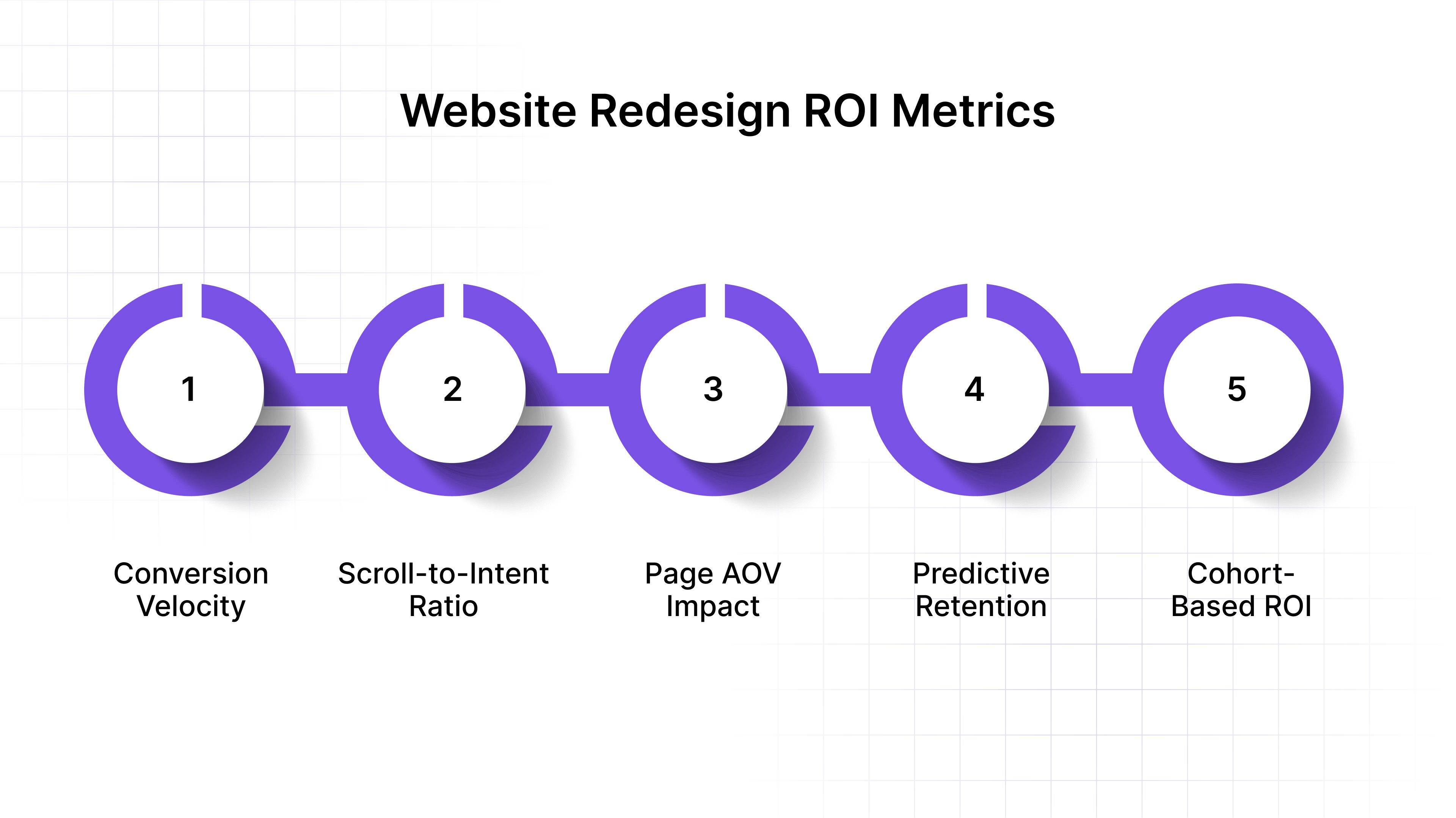
Here are advanced, often-overlooked ways to measure redesign ROI accurately:
Measure Conversion Velocity Instead of Just Rate: Track how quickly a user moves from first visit to first purchase. A faster conversion cycle indicates lower friction and higher funnel efficiency, especially in grocery or fashion, where buying windows are short.
Track Scroll-to-Intent Ratios on Key Pages: Traditional metrics like bounce rate lack context. Scroll-to-intent measures how many visitors reach a decisive action point, such as size selection or bundle configuration. This ratio reveals how persuasive your new structure is.
Evaluate Page-Level Contribution to AOV: Instead of attributing total AOV gains to the whole site, identify which redesigned page types contribute the most uplift, PDPs, cart modals, or upsell pages. That helps you replicate success where ROI concentrates.
Use Predictive Retention Modeling to Assess Long-Term Payoff: Modern tools combine first-session behavior with churn probability to estimate lifetime value uplift. If redesigned flows improve “repeat likelihood score,” it signals enduring ROI beyond immediate purchases.
Apply Cohort-Based ROI Tracking: Instead of comparing all traffic, evaluate ROI by cohorts (first-time vs. returning users, paid vs. organic). This isolates how your redesign impacts different audiences and avoids misleading blended averages.
True ROI comes from connecting design performance to profitability across every layer, acquisition, engagement, retention, and internal efficiency, not just the conversion uplift visible in analytics dashboards.
How Nudge Helps You Redesign for Real Conversion Gains
Modern eCommerce brands demand results faster than traditional redesign cycles allow. Nudge empowers growth and marketing teams to deliver real-time personalization, conversion optimization, and experimentation. Instead of static websites, you get continuously learning experiences that evolve with every shopper action.
Below are the most powerful ways Nudge accelerates redesign ROI and drives measurable conversion growth:
Real-Time Personalization Across the Funnel:
Nudge dynamically adapts every touchpoint, homepages, landing pages, product listings, and checkout, to match each buyer’s journey, campaign source, and browsing behavior. For example, a shopper from a beauty ad sees tailored skincare bundles, while a grocery visitor sees delivery-ready combos. These instant adjustments create a personalized journey that strengthens conversion intent from the first second.AI Product Recommendations:
Using deep context signals such as browsing time, scroll behavior, and prior interactions, Nudge places intelligent product suggestions and smart bundles across PDPs, carts, and exit flows. If a fashion shopper views multiple tops, the system promotes compatible accessories or bundle offers tied to inventory in real time. This continuous intelligence increases AOV while keeping engagement friction-free.Commerce Surfaces:
Nudge’s AI-powered commerce surfaces instantly build modular, shoppable sections, combining products, offers, and videos dynamically. A retail brand can serve interactive lookbooks or flash deal grids that change by hour, source, or device. These surfaces turn static pages into high-conversion micro experiences, significantly reducing bounce and session fatigue.Contextual Nudges:
Nudge detects subtle behavioral cues like scroll depth, exit intent, or idle time and triggers timely modals, banners, or micro-offers aligned to intent. For example, a user hesitating at checkout might receive a “Free Next-Day Delivery” nudge, while a new visitor on a PDP gets a “Top Seller in Your Area” prompt, lifting conversion without disrupting flow.No Dev Bottlenecks and Continuous Experimentation:
Growth teams using Nudge deploy, test, and iterate on personalization or layout experiments without engineering support. Each module, from dynamic content blocks to A/B nudges, can be published instantly. This speed shortens feedback loops from weeks to hours, allowing marketers to refine UX based on live data rather than waiting for developer bandwidth.Continuous Learning That Compounds Over Time
Every shopper interaction teaches Nudge’s AI model how to improve relevance, timing, and presentation. Over weeks, the platform refines personalization logic across traffic segments, devices, and locations, creating a self-optimizing experience. This compounding advantage means every redesign becomes smarter automatically, enhancing CVR, AOV, and LTV while reducing acquisition costs.
Through its AI-first, marketer-friendly ecosystem, Nudge turns every redesign into a living, data-driven system. One that evolves continuously, learns from behavior, and ensures your website never falls behind customer expectations.
Conclusion
Every eCommerce redesign carries both opportunity and risk. What truly differentiates high-growth brands isn’t just how well they execute visual changes, but how fast they learn, adapt, and scale insights across every digital surface. Growth today depends on responsiveness, the ability for your website to evolve as quickly as your audience does.
AI-driven systems like Nudge change this dynamic by transforming your website into a responsive, living platform. If you’re ready to make your next redesign not just a visual refresh but a measurable growth engine, experience how Nudge can help you deliver adaptive personalization, smarter conversion logic, and compounding ROI.
Book a demo with Nudge to see how real-time personalization and AI-driven optimization can turn your website into a conversion system that never stops improving.
FAQs
1. How do you redesign an eCommerce site without losing SEO traffic or rankings?
Maintain existing URL structures, redirect legacy pages with 301s, and preserve on-page metadata during migration. Run a crawl map before and after launch to compare index coverage. Validate structured data, canonical tags, and internal linking. Continuous monitoring ensures organic equity remains intact post-redesign.
2. Which pages should be prioritized first during an eCommerce redesign to lift CVR fastest?
Focus on high-intent zones: product detail pages, cart, and checkout flows. Optimize above-the-fold CTAs, trust signals, and mobile performance first. These pages directly influence purchase completion, AOV, and retention. Once conversion-critical paths are refined, move to homepage and category pages for discovery and engagement uplift.
3. Do Core Web Vitals directly affect conversion rate during a redesign, and which metrics matter most?
Yes, Core Web Vitals directly correlate with engagement and purchase intent. Largest Contentful Paint (LCP), Cumulative Layout Shift (CLS), and Interaction to Next Paint (INP) influence user trust and session flow. Optimizing these metrics reduces perceived wait time, enhances stability, and drives higher conversions across mobile-first experiences.
4. What is the difference between a website refresh and a full redesign for online stores?
A refresh updates visual elements, layout consistency, and copy without altering site architecture. A full redesign re-engineers structure, technology, and customer flow. While refreshes improve brand perception short-term, redesigns rebuild scalability and performance foundations, critical for multi-channel commerce growth and advanced personalization initiatives.
5. How should the ROI of a website revamp be measured beyond conversion rate alone?
Assess holistic impact, average order value, repeat purchase rate, customer lifetime value, and cost per acquisition. Track post-launch engagement depth, page velocity, and checkout completion time. Integrate analytics dashboards comparing revenue retention, not just spike metrics, to identify sustainable performance improvements beyond initial conversion gains.