CRO & Experimentation
Top 5 Examples of High Converting Websites in 2025
Explore 2025’s best examples of high converting websites such as Mint, Discord, and Rookwood. See how brands use design, CTAs, and personalization to turn visitors into customers.

Sakshi Gupta


For high-growth ecommerce and DTC marketers, every click from paid campaigns represents a potential customer, but many visitors leave before completing a purchase. This lost opportunity highlights the need for a high-converting website.
A "high-converting" website today isn't just about aesthetics; it's about delivering a seamless, personalized, and frictionless experience that turns visitors into loyal customers. With 62.54% of global website traffic coming from mobile devices in Q2 2025, shoppers expect sites that respond to their behavior, build trust, and present relevant offers in real time.
AI-driven personalization and dynamic interfaces are helping brands make every interaction count, turning browsers into repeat buyers. This blog explores the top 5 examples of high converting websites in 2025, highlights their key features, and shares lessons that you can apply to your own site.
Key Takeaways:
High converting websites provide a smooth and intuitive experience with easy navigation, fast load times, and consistent performance across all devices.
Personalization actively engages visitors by presenting content, offers, and suggestions tailored to their interests and actions.
Building trust through clear value propositions, social proof, and secure interactions encourages visitors to act with confidence.
Continuous optimization keeps conversion rates rising. By testing layouts, CTAs, and AI-driven personalization, your website evolves to meet visitor expectations.
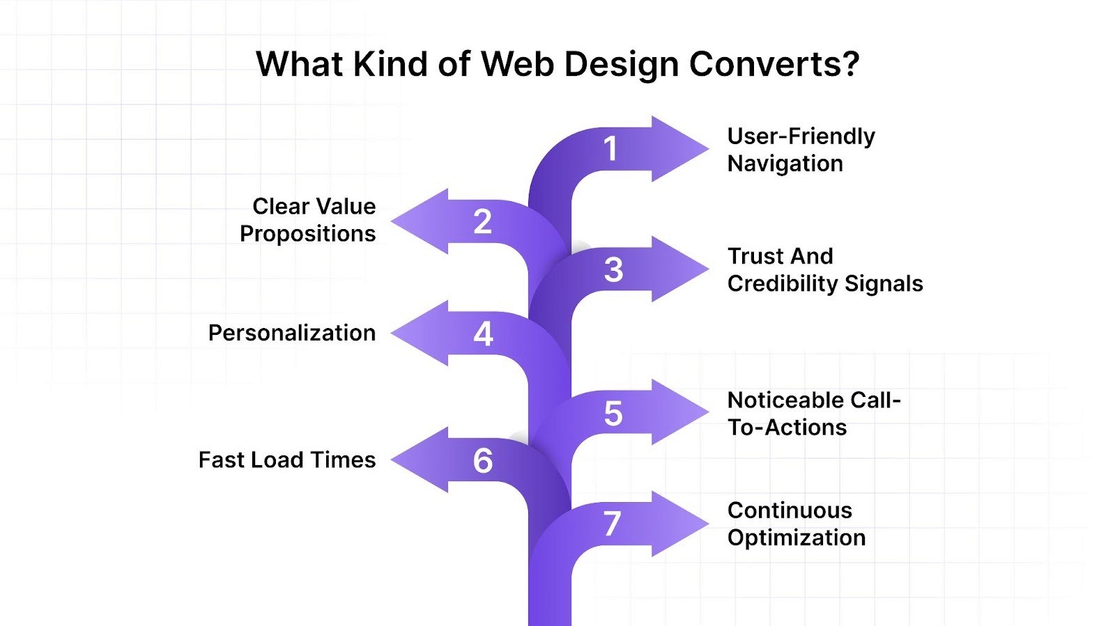
What Kind of Web Design Converts?
In the fast-paced digital world, having a website that converts visitors into customers is essential. But what kind of web design achieves this?
User-Friendly Navigation: Easy navigation ensures visitors can quickly find what they're looking for. Use clear menus, logical categories, and a search function to make your site intuitive.
Clear Value Propositions: Clearly state what makes your product or service unique. Highlight benefits prominently on your homepage and product pages to show visitors why they should choose you.
Trust and Credibility Signals: Security badges, customer reviews, testimonials, and brand recognition help reduce hesitation. When users feel confident about the site and its offerings, they are more likely to take action.
Personalization: Tailor content, product recommendations, and offers based on visitor behavior, location, or campaign source. Personalized experiences make users feel understood and increase engagement rate.
Noticeable Call-To-Actions (CTAs): Effective CTAs guide visitors toward taking action. Use bold buttons, compelling text, and strategic placement to encourage clicks.
Fast Load Times: Speed matters. A fast-loading site keeps visitors from bouncing away. Optimize images and use efficient coding to improve load times.
Continuous Optimization: High converting websites experiment with layouts, copy, CTAs, and personalization to continuously improve conversion rates.

Now that we understand what makes a site convert, let’s see these principles in action across five standout websites.
Also Read: Determining a Good Average Conversion Rate for Your Online Business
Top 5 Examples of High Converting Websites in 2025
Understanding what makes a website convert is best done by examining real-world examples. The following five sites show how effective design, personalization, and user experience strategies consistently drive conversions.
1. Mint
Mint, Intuit’s personal finance platform, turns visitors into users by combining clarity, trust, and personalization. The website guides you through complex financial concepts, making money management simple and actionable. By showcasing its value right away and offering interactive dashboards, Mint delivers an intuitive, tailored experience.
Key Features:
1. Clear, User-Friendly Design
Mint’s interface helps users navigate easily, even with minimal financial knowledge:
A clean, uncluttered dashboard provides an overview of spending, income, and financial health at a glance.
Color-coded charts and graphs make financial data easy to digest.
Well-structured categories (e.g., "Budgets," "Bills," "Investments") let users find what they need quickly.
2. Noticeable CTAs (Call-to-Actions)
Mint strategically places CTAs to guide users toward key actions:
“Sign Up for Free” is prominently displayed on the homepage to encourage new users.
“Connect Your Accounts” pushes users to link bank accounts, credit cards, and loans to maximize Mint’s utility.
“Upgrade to Mint Premium” promotes paid features subtly without disrupting the free user experience.

3. Effective Use of Visuals
Mint makes financial management more engaging through visuals:
Infographics and pie charts break down spending habits, making it easier to analyze trends.
Dynamic budget meters show how much users have spent in each category (e.g., groceries, entertainment).
Icons and color-coded alerts help users quickly spot areas that need attention, like upcoming bills or overspending.
4. Simple Sign-Up Process
Mint simplifies onboarding with:
A quick, three-step sign-up requiring only an email, password, and basic financial information.
Seamless bank integration that automatically syncs transactions.
A guided onboarding experience, explaining key features and how to set up budgets.
5. Testimonials and Success Stories
Mint builds trust and credibility through social proof:
Customer testimonials showcase real-life financial improvements (e.g., “Mint helped me save $500/month!”).
Case studies and blog posts share tips on budgeting, credit improvement, and debt management.
App store and website reviews highlight Mint’s ease of use and effectiveness, reinforcing its reputation.
2. Discord
Discord’s site effectively highlights its community features, drawing users with vibrant visuals and straightforward navigation. Clear CTAs encourage downloads and account creation quickly. Discord’s homepage features dynamic content that explains the platform’s unique value, such as voice channels, chat rooms, and community building. The design is both modern and inviting, making it easy for users of all tech levels to get started.
Key Features:
1. Vibrant Visuals
Discord’s branding is fun, playful, and community-driven, reflected in its design:
Bright color schemes (blue, purple, and gradients) create an inviting and modern feel.
Custom illustrations and mascots (like Wumpus) add personality and make the platform feel approachable.
Animated transitions and micro-interactions enhance UX without cluttering the interface.
2. Straightforward Navigation
With millions of servers and users, Discord ensures ease of use through:
A clean sidebar layout displaying servers, channels, and direct messages in a structured manner.
Quick-access icons and search functionality allow users to find conversations and communities effortlessly.
Minimalist menus with clear labels, making settings and customization options easily accessible.
3. Clear CTAs (Call-to-Actions)
Discord strategically places bold, action-driven CTAs to encourage engagement:
“Download for Windows / Mac” buttons are prominently placed to drive new user adoption.
“Create a Server” and “Join a Server” options make it easy to get started.
“Upgrade to Nitro” CTA is subtly integrated without disrupting the free-user experience.
4. Dynamic Content Explaining Features
Discord uses interactive elements, animations, and well-structured explanations to educate users:
Feature-driven landing pages (e.g., for voice chat, screen sharing, and community management) use animations to showcase functionality.
Tooltips and onboarding tutorials help new users navigate servers, roles, and voice channels efficiently.
Engaging explainer videos and GIFs highlight Discord’s evolving capabilities, from gaming communities to professional team collaboration.
3. Rookwood
Rookwood impresses with its artistic, elegant design, showcasing its handcrafted ceramics. The site’s detailed product descriptions, high-quality imagery, and artisan stories create a strong connection between the customer and the product. The easy-to-navigate catalog and seamless checkout process enhance the user experience.
Key Features:
1. Artistic, Elegant Design
Rookwood’s website and stores reflect the craftsmanship of its pottery: The layout features:
Sophisticated typography and muted, earthy tones that evoke a sense of timeless artistry.
Clean, well-balanced page structures, ensuring products remain the focal point.
Subtle design elements like hand-drawn accents and classic motifs that reflect the brand’s heritage.
2. Detailed Product Descriptions
Since Rookwood’s ceramics are handcrafted and often one-of-a-kind, its product descriptions provide:
Rich storytelling about each piece, including historical inspiration and artistic techniques.
Specific dimensions, materials, and glaze details help buyers make informed decisions.
Usage recommendations such as pairing a vase with certain flowers or incorporating tiles into custom interior designs.

3. Beautiful Imagery
High-quality imagery plays a vital role in showcasing Rookwood’s artistry. The brand features:
Close-up, high-resolution images capturing fine details like glaze textures and intricate hand-carving.
Styled product photography, showing how pieces look in real-world settings like luxury homes or artful tablescapes.
Behind-the-scenes images of artisans at work, reinforcing the brand’s handcrafted authenticity.
4. Stories About Artisans
Rookwood highlights the human touch behind every piece through:
Artist profiles and interviews, showcasing the skilled craftspeople who bring designs to life.
Videos and blogs detailing the pottery-making process, from clay preparation to final glazing.
Heritage storytelling, connecting Rookwood’s 19th-century origins to its modern revival, adds emotional value to each purchase.
5. Easy-to-Navigate Catalog
Rookwood ensures smooth browsing for diverse products:
Well-structured categories for easy exploration (e.g., “Vases,” “Tiles,” “Gifts”).
Filters for color, style, and collection, helping shoppers quickly find what suits their aesthetic.
Quick-view and comparison options, allowing customers to assess products effortlessly before making a decision.
4. SEMrush
SEMrush’s website is a hub of digital marketing resources featuring detailed tool descriptions and success stories. Its engaging content, coupled with free trial options, motivates visitors to explore and use the platform. The site’s design is both informative and user-friendly, guiding visitors through its range of tools and features effectively.
Key Features:
1. Detailed Tool Descriptions
SEMrush clearly presents each tool with comprehensive, user-friendly explanations:
Feature-specific landing pages highlight SEO, PPC, content marketing, and competitor analysis tools.
Interactive screenshots and demos help users understand functionality quickly.
Comparison tables highlight plan differences, making decisions simple for new users.
2. Success Stories
The platform uses customer stories to build trust and show real-world results:
Case studies reveal measurable outcomes from clients across industries.
Client logos and testimonials reinforce SEMrush’s authority in digital marketing.
Video testimonials provide engaging, authentic insights from existing users, increasing confidence in the platform.
3. Engaging Content
SEMrush keeps users engaged with a variety of content formats:
Blogs, guides, and whitepapers teach users while promoting tools naturally..
Interactive charts and data visualizations help users explore insights dynamically.
Webinars and live events are integrated into the website, encouraging ongoing learning and deeper platform engagement.
4. Free Trial Offers
The platform drives conversions with clear trial options:
“Start Free Trial” buttons appear prominently throughout the site.
Trial offers highlight the immediate benefits of using SEMrush tools.
Pop-ups and CTAs for trials appear contextually based on visitor behavior, boosting the chances of conversion.
5. User-Friendly Design
Visitors navigate the site easily, finding what they need fast:
Clean navigation menus and search functionality make it easy to access tools and resources.
Mobile-responsive design maintains usability across devices.
Intuitive design guides users naturally to key actions like trial signup or content download.
5. Jumix Design
Jumix Design’s website showcases its expertise in web design and digital marketing with a visually appealing, professional layout. The portfolio section and user testimonials build trust and attract new users. The clear value propositions and contact options make it easy for potential customers to reach out and start a project.
Key Features:
1. Professional Layout
The site uses a clean, modern design to guide visitors smoothly:
Consistent colours and typography reinforce brand identity and hierarchy.
Balanced sections with headings, visuals, and text guide visitors through services clearly.
Modular design blocks let users scan easily while exploring details if needed.
2. Portfolio Section
Jumix Design emphasizes past work to build credibility:
Case studies highlight specific projects, illustrating processes, results, and creativity.
High-resolution images and interactive elements make projects visually compelling.
Filterable project categories enable visitors to find relevant examples tailored to their needs.
3. User Testimonials
Client feedback reinforces trust and authenticity:
Written testimonials outline challenges, solutions, and outcomes, helping prospects relate.
Video testimonials add authenticity and strengthen engagement.
Strategic placement throughout the site reassures users at multiple decision points.
4. Clear Value Propositions
Jumix Design communicates its benefits directly and effectively:
Headlines and subheadings convey unique selling points immediately.
Service descriptions include clear explanations of what clients gain from working with the agency.
CTAs consistently guide visitors to the next step, such as “scheduling consultations” or “exploring portfolios”.
5. Easy Contact Options
The website makes it simple for visitors to reach out:
Prominent contact forms and consultation CTAs appear throughout pages.
Multiple contact methods (form, email, phone) cater to user preferences.
Integrated scheduling tools streamline consultation booking and improve conversions.
Having explored these examples, let’s discuss the key lessons that you can apply to your own site in the next section.
Also Read: Website Conversion Rate Optimization: Techniques and Tips to Get Started
Learning Points from High Converting Websites
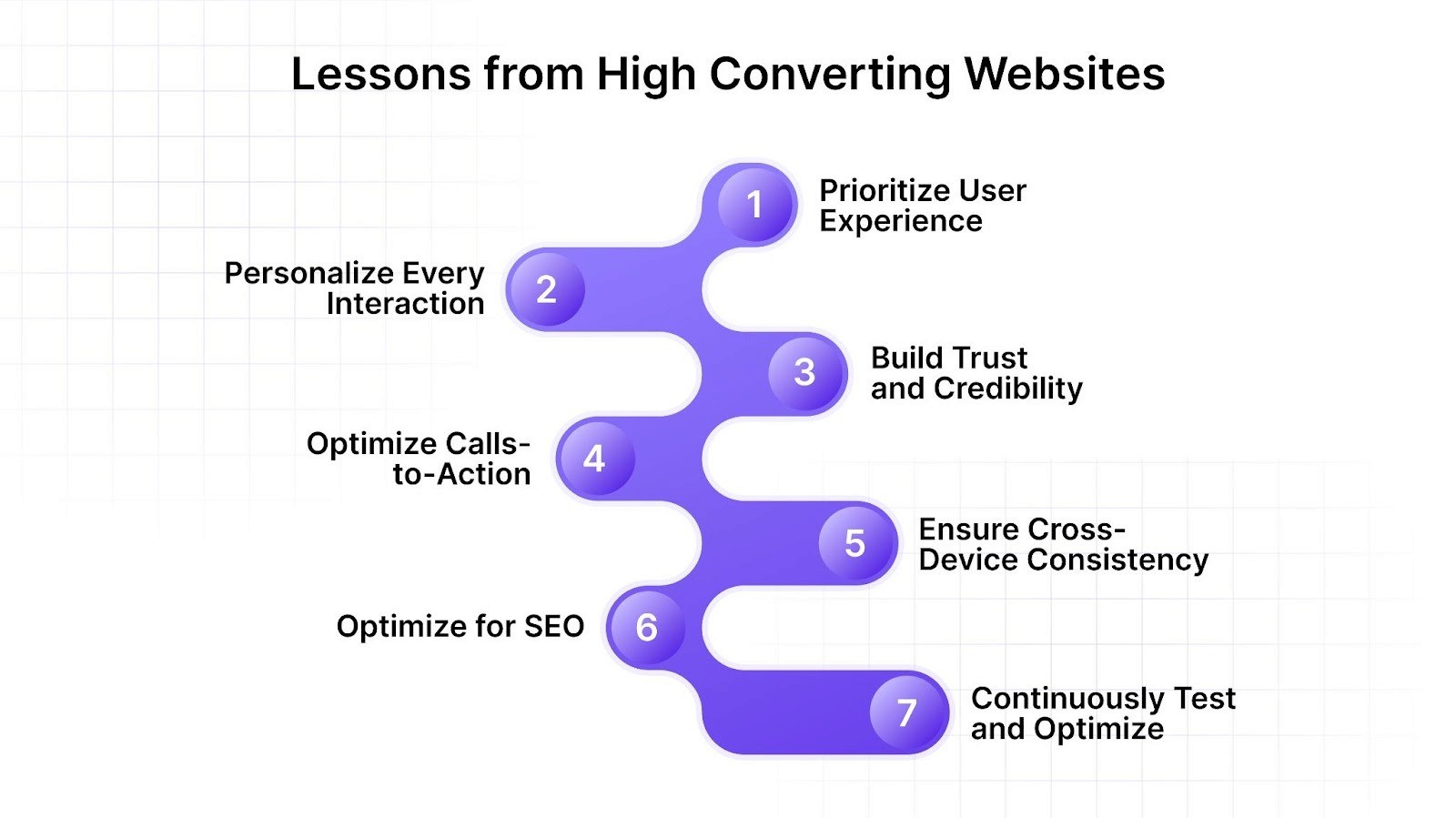
So, what did we learn from these examples? What should you follow to turn your page into a high converting website? Here are some key takeaways that you can apply:
1. Prioritize User Experience
High converting websites focus on creating an intuitive and enjoyable user experience. This includes clear navigation, fast load times, and a responsive design. Ensuring visitors can easily find what they need and enjoy a seamless browsing experience is crucial.
Key Takeaways:
Simplify navigation with clear menus and search options
Optimize load times to prevent drop-offs
Ensure mobile responsiveness for consistent experiences across devices
2. Personalize Every Interaction
Personalization is no longer optional; it’s expected. High converting websites adapt product recommendations, offers, and layouts based on behavior, campaign source, and location. When users see content that reflects their intent, they’re far more likely to engage and convert.
Key Takeaways:
Use browsing history and purchase data to tailor product suggestions
Adapt offers and messages based on campaign UTMs or traffic sources
Adjust layouts dynamically for location, device, or behavior patterns
3. Build Trust and Credibility
Users won’t convert if they don’t trust a website. From reviews and testimonials to clear return policies and secure checkout processes, users want reassurance before committing. High converting websites remove hesitation by embedding trust signals at every stage of the funnel.
Key Takeaways:
Add reviews and testimonials to PDPs and landing pages
Use trust badges and secure payment icons at checkout
Highlight well-known partners, media mentions, or certifications
4. Optimize Calls-to-Action (CTAs)
CTAs guide users toward the next step, and high converting websites make them hard to miss. These CTAs are context-specific, clear, and strategically placed to maximize engagement. Whether it’s “Add to Cart,” “Start Free Trial,” or “Book a Demo,” the message is always direct.
Key Takeaways:
Use action-driven copy like “Get Started” or “Buy Now”
Place CTAs above the fold and throughout the page
Test different formats (buttons, banners, sticky CTAs) to see what works best
5. Ensure Cross-Device Consistency
Users interact with websites across multiple devices, and inconsistent experiences can hurt conversions. High converting websites ensure landing pages, PDPs, carts, and checkout flows work flawlessly on desktop, tablet, and mobile.
Key Takeaways:
Maintain design consistency across desktop, tablet, and mobile
Sync shopping carts and user preferences across devices
Optimize forms and checkouts for mobile usability
6. Optimize for SEO
High converting websites are also easy to find. They follow best SEO practices to ensure they rank well on search engines, driving organic traffic. This includes keyword optimization, quality content, and technical SEO.
Key Takeaways:
Use relevant keywords
Create high-quality content
Ensure technical SEO is in place
7. Continuously Test and Optimize
High converting websites are always evolving. Regular A/B testing and performance analysis help identify what works and what doesn’t, allowing for continuous improvement and higher conversion rates.
Key Takeaways:
Run A/B and multivariate tests regularly
Monitor metrics like bounce rate, CVR, and AOV for insights
Use AI-driven experimentation to adapt in real time
Also Read: Key Tactics to Improve Website Conversion and Its Impact on ROI
How Nudge Can Help You Build a High-Converting Website in 2025?
Nudge provides an autonomous experience layer that transforms every website session into a personalized storefront. It equips marketers to optimize high converting websites without relying on developers.
Here’s how we can help you:
1. Funnel Personalization:
With Nudge, every homepage, landing page, PDP, PLP, cart, and checkout can adapt instantly to the user’s intent, campaign source, and behavior. Instead of sending all traffic through the same generic layout, the experience shifts in real time. For example, a shopper arriving from TikTok could see trending bundles while one from Google might see category-focused offers. This immediate contextual personalization reduces drop-offs and improves conversion rates.
2. AI-Powered Product Recommendations and Bundles:
Nudge ensures recommendations are not only relevant but also synced with inventory and shopper intent. Dynamic bundles can be built automatically, factoring in product affinities, purchase history, and cart contents. This means customers see the right upsells or cross-sells without manual setup from marketers. The result is a measurable lift in AOV and stronger engagement at the exact moment buyers are ready to act.
3. Contextual Nudges:
Beyond recommendations, Nudge triggers targeted messages like urgency banners, exit-intent offers, or seasonal promos. These nudges appear in the right format—popups, sticky banners, or modals—based on real-time behavior such as scroll depth, referrer, or time-on-page. Instead of static, one-size-fits-all messaging, shoppers receive personalized prompts that encourage them to continue their journey and complete purchases.
4. Empowering marketers without dev bottlenecks
Traditionally, conversion experiments depend on development cycles, slowing down execution. Nudge removes this barrier by giving marketing teams direct control to launch, test, and iterate campaigns instantly. This not only speeds up optimization but also frees engineering teams to focus on core product innovation.
5. Continuous learning for long-term conversion growth
Unlike static A/B tests that become outdated, Nudge’s AI evolves with every interaction. It learns from campaign performance, user behavior, and purchase patterns to improve personalization over time. This creates a compounding advantage—more relevance, less manual effort, and future-proofed conversion strategies.
By integrating Nudge, brands can deliver tailored experiences that drive conversions and foster customer loyalty.
Conclusion
So, it can be said that a high converting website prioritizes user experience, uses clear CTAs, highlights value propositions, incorporates social proof, and follows SEO best practices. Additionally, providing engaging content, simplifying the checkout process, leveraging personalization, using high-quality visuals, and continuously testing and optimizing are crucial aspects.
By leveraging these insights, you can significantly improve your website’s design and conversion rate. Embrace these strategies to create a user-friendly, appealing, and effective website that turns visitors into loyal customers. Start implementing these changes today and watch your conversion rates soar.
Book a demo with us as we offer a wide range of features that are user-friendly and easy to navigate, which will enhance your user experience and give your users many reasons to come back!
FAQs
1. Is a 25% conversion rate good?
Yes, a 25% conversion rate is excellent. Most websites see rates between 1–5%. Achieving 25% indicates highly targeted traffic, compelling offers, and effective design and messaging. However, benchmarks vary by industry, audience, and conversion type.
2. What is the anatomy of a high converting website?
A high converting website combines clear value propositions, intuitive navigation, fast loading times, trust signals, and persuasive content. It prioritizes user experience, focuses on seamless interactions, and strategically places CTAs, ensuring visitors are guided toward conversion at every step.
3. What is the cost per website conversion?
Cost per conversion varies widely depending on traffic source, industry, and campaign efficiency. Paid campaigns may range from a few dollars to hundreds per conversion, while organic traffic often lowers the cost. Measuring and optimising CPC ensures budget efficiency.
4. Which elements are most frequently highlighted in the best high converting website designs?
Top high converting websites emphasise compelling headlines, trust badges, strong visuals, intuitive navigation, responsive layouts, clear CTAs, customer testimonials, and fast-loading pages. Each element is designed to guide visitors effortlessly toward completing desired actions.
5. Are there any common CTA strategies for high converting sites?
Effective CTAs are clear, action-oriented, and visually distinct. Common strategies include urgency (limited-time offers), social proof (reviews, testimonials), benefit-focused language, and repeated placement across pages to capture attention without overwhelming visitors.