CRO & Experimentation
Top 10 Ecommerce Navigation Best Practices and Optimization Examples
Master ecommerce navigation with predictive analytics, mega menus, and mobile enhancements. Click to boost user engagement now!

Sakshi Gupta
Nov 3, 2025

Modern shoppers expect navigation that makes finding products effortless. As an ecommerce manager or brand owner, you know how frustrating it is when visitors leave because they can’t find what they want. In fact, nearly 43% of online shoppers abandon sites for this reason, directly impacting conversions and sales. Yet many ecommerce sites still rely on generic menus, search bars, and one-size-fits-all filters that fail to meet shopper expectations.
To turn this around, it’s crucial to design navigation that aligns with how customers interact with your site. Every click and scroll should bring visitors closer to what they’re looking for, guiding them smoothly from discovery to purchase. By optimizing your navigation, you can reduce friction, boost engagement, and ultimately increase sales.
In this guide, we’ll break down the best practices for ecommerce navigation and showcase real-world examples to help you create a seamless, user-friendly experience that drives conversions.
Key Takeaways
Ecommerce navigation directly impacts conversions, with 43% of shoppers leaving sites when they cannot find products quickly.
Personalization and predictive tools make product discovery faster and easier, guiding users with suggestions, search auto-complete, and tailored product grids.
Mobile-friendly designs with thumb-friendly buttons, sticky headers, and collapsible menus ensure smooth browsing on smaller screens.
Mega menus and clear category hierarchies simplify large catalogs, helping users explore efficiently without feeling overwhelmed.
Continuous UX testing and AI-driven nudges allow brands to optimize navigation over time, increasing engagement and conversions.
What is Ecommerce Navigation?
Ecommerce navigation is the system that helps shoppers move through your online store to find products, information, and services quickly and efficiently. It includes your menus, category pages, filters, search functionality, and even mobile-specific elements like sticky headers and thumb-friendly buttons.
Good navigation does more than just help users browse; it shapes how customers interact with your brand. Clear paths to products, visually guided categories, and intuitive search can reduce friction, shorten the time to purchase, and influence the overall perception of your brand. So, navigation is a key driver of engagement, retention, and conversions.
With this foundation, let’s explore why ecommerce navigation plays such a critical role in your store’s success.
Why Does Ecommerce Navigation Matter?
Effective navigation directly impacts your store’s performance. Shoppers expect fast, frictionless experiences. Even minor confusion or slow product discovery can lead to high bounce rates and abandoned carts. Clear and optimized navigation allows you to:
Improve product discovery: Shoppers can find what they want faster, increasing the likelihood of purchase.
Enhance user experience: Smooth navigation across devices keeps customers engaged and reduces frustration.
Increase conversions: Intuitive paths guide users from browsing to checkout seamlessly.
Encourage exploration: Well-structured categories and filters invite shoppers to discover more products.
Build trust and credibility: When shoppers navigate easily, they perceive your store as professional and reliable.
For e-commerce and DTC brands, navigation is not just a UX concern, it’s a revenue lever. Optimizing menus, search, filters, and mobile layouts ensures every visitor can find what they need quickly, stay longer on your site, and ultimately complete a purchase.
With Commerce Surfaces, you can build dynamic landing experiences with AI showing personalized product grids, offers, and shoppable videos that adapt in real-time to shopper behavior. Create immersive navigation experiences that guide users toward purchase faster.

Next, we’ll explore 10 best practices for ecommerce navigation that translate these benefits into real-world results.
10 Best Practices for Ecommerce Navigation
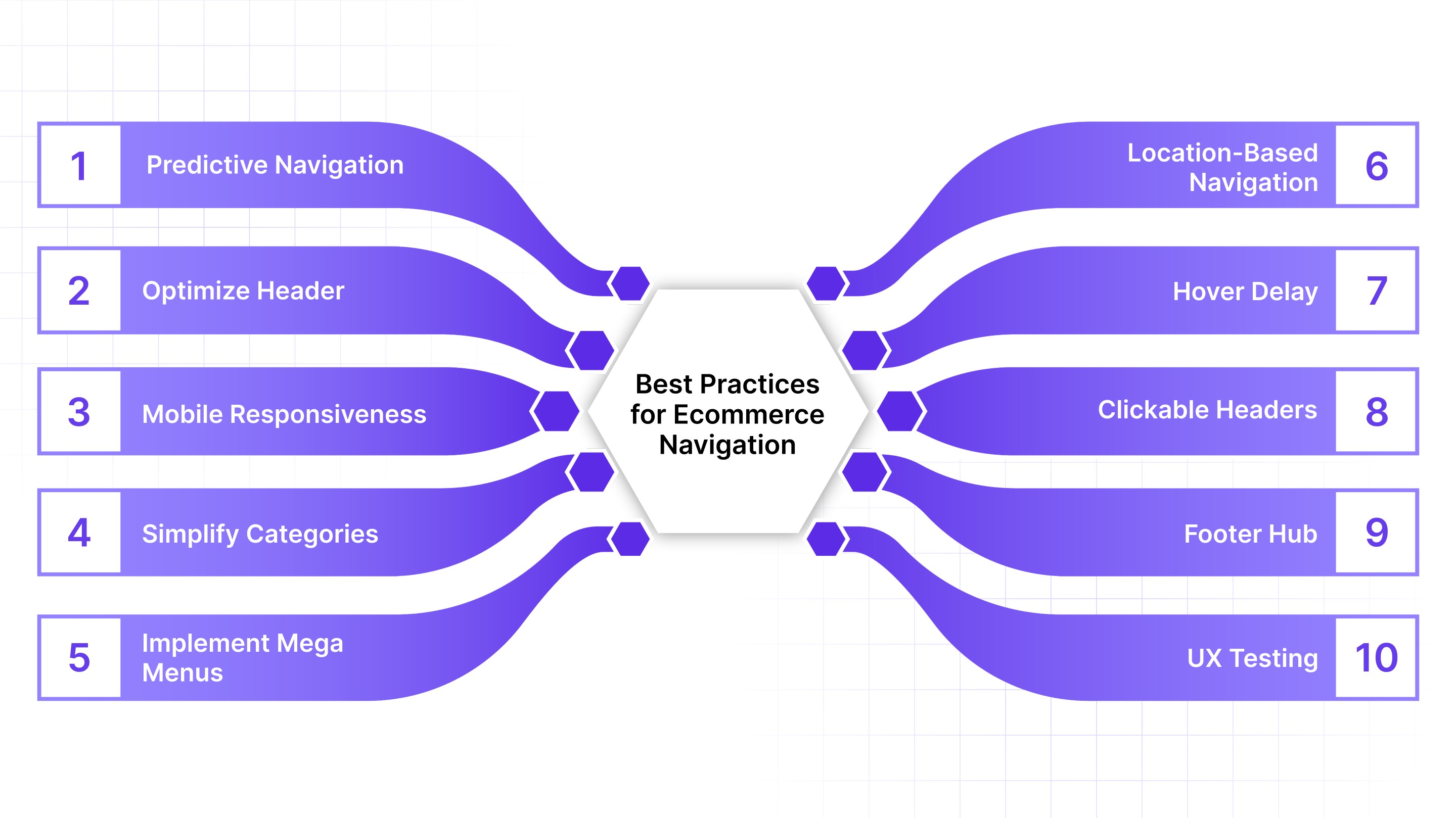
Applying these best practices to your ecommerce site can greatly improve the overall shopping experience by making it easier for users to find products, explore categories, and complete purchases, which in turn can help increase engagement and improve conversion opportunities across the site.
Here’s how you can structure your navigation to support every shopper journey effectively.
1. Personalize Navigation with Predictive Analytics
Using predictive analytics allows your site to guide users along personalized navigation paths that are based on their browsing history, popular searches, and behavioral patterns.
By incorporating features such as predictive search, auto-suggestions, and product images in search results, you can make it significantly faster and easier for users to locate the products they are looking for, which reduces friction and encourages purchases.
Example:
Amazon has implemented predictive search that suggests products, categories, and recently viewed items in real-time, which minimizes the effort required to search for products and helps users reach relevant options quickly, ultimately increasing the likelihood of completing a purchase.
Also Read: Improving E-commerce Success with Nudge’s Customer Experience Tools
2. Optimize Header and Main Navigation
The header is often the first point of interaction for visitors, and designing it in a way that highlights top categories, search functionality, and key calls-to-action while maintaining a clean and organized visual hierarchy.
It helps users scan the options quickly and decide where to go next without feeling overwhelmed, which ensures a smoother browsing experience and encourages further exploration.
Example:
Nike simplified its header by emphasizing key categories such as Shoes, Clothing, and Accessories, and included a prominent search bar, which made it easier for visitors to navigate, reduced bounce rates, and improved product discovery across the site.
3. Enhance Mobile Responsiveness
With mobile commerce becoming increasingly dominant, it is essential that your navigation adapts seamlessly to smaller screens by using thumb-friendly buttons, sticky headers, collapsible menus, and filters.
It makes browsing effortless for users and ensures that they can explore your site comfortably on any device, leading to higher engagement and conversion rates.
Example:
Zara redesigned its mobile navigation to include a clean hamburger menu with collapsible categories and sticky headers, which allowed users to explore products more easily on mobile devices, resulting in longer session durations and improved mobile conversion performance.
4. Simplify Category Navigation
Organizing categories and subcategories in a logical and consistent manner helps users understand your product catalog quickly, and by using descriptive labels, breadcrumbs, and clear paths, you can reduce the number of clicks needed to reach a product, prevent user frustration, and make the entire shopping experience more intuitive and enjoyable.
Example:
Wayfair restructured its category navigation and introduced breadcrumbs such as Home > Furniture > Sofas > Sectionals, which allowed users to see their current location within the catalog and navigate back easily, reducing drop-offs and improving overall usability.
5. Implement Mega Menus for Complex Sites
For ecommerce sites with large product catalogs, mega menus provide an efficient way to display multiple categories and subcategories in a single view.
By incorporating icons, images, and featured products within these menus, you can help users scan options quickly, explore related items, and avoid confusion that might arise from overcrowded dropdowns.
Example:
Myntra’s mega menu showcases top categories, subcategories, product images, and trending offers in a structured layout, which made it easier for users to discover more products and increased engagement with highlighted items across the site.
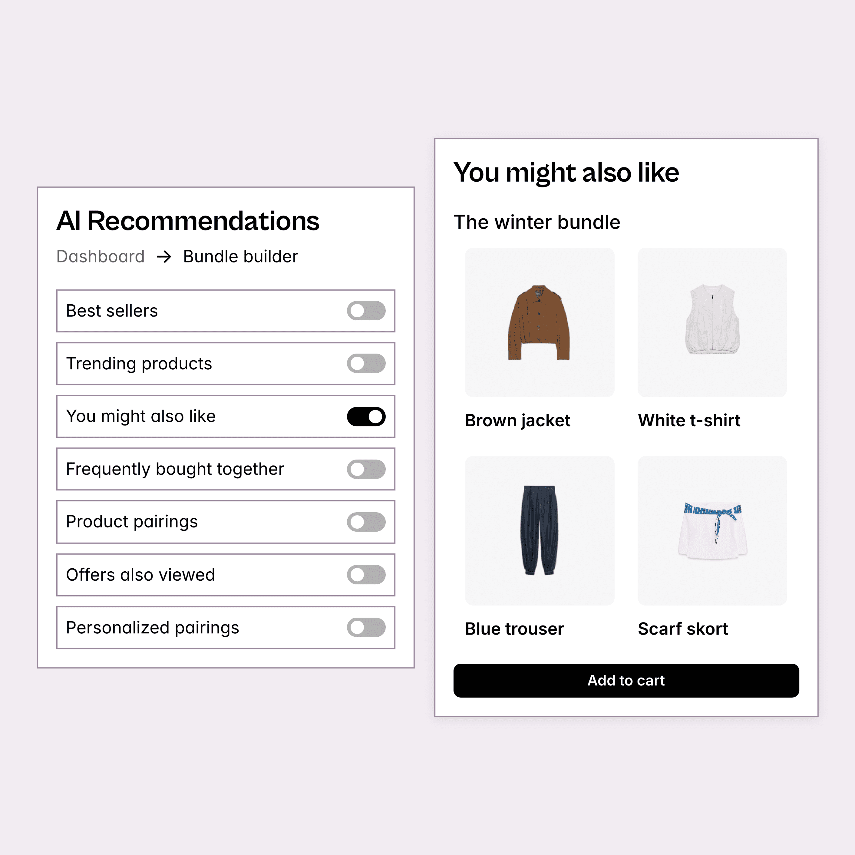
Nudge uses dynamic, personalized AI product recommendations to align with each shopper’s behavior and preferences. By tailoring product suggestions and upsell bundles across PDPs, carts, and checkout, it matches customer intent, creates more relevant shopping experiences, and increases conversions.

6. Add Location-Based Navigation Elements
Incorporating location-aware features into your navigation can make the shopping experience more relevant and personalized.
By showing nearby stores, region-specific products, or local shipping information, you can increase user trust, ensure product availability aligns with user needs, and enhance overall satisfaction.
Example:
Amazon India automatically detects a user’s location to highlight products eligible for next-day delivery and region-specific offers, which ensures that users see relevant inventory, improves trust in the platform, and increases the chances of purchase.
7. Ensure Hover Delay in Dropdown Menus
Dropdown menus that close too quickly can frustrate users and disrupt the browsing experience, so implementing a slight hover delay allows users to interact with menus smoothly, prevents accidental closures, and provides a more fluid navigation experience on both desktop and touch devices.
Example:
Zappos added a 200ms hover delay to its dropdown menus, which reduced accidental menu closures and allowed users to explore subcategories more comfortably, resulting in higher engagement with product categories.
8. Use Clickable Headers and Subcategory Thumbnails

Making parent categories clickable gives users more control over their navigation journey, and adding thumbnail images for subcategories provides visual cues that make it easier to scan options and select products quickly, which is particularly effective for visually driven categories such as fashion, home décor, or electronics accessories.
Example:
H&M implemented clickable parent categories such as Women and Men, along with subcategory thumbnails for sections like Shirts and Footwear, which allowed users to navigate more intuitively and encouraged exploration of additional products.
9. Enhance Footer as a Resource Hub
The footer should serve as a secondary navigation tool rather than an afterthought, and by providing links to top categories, support pages, policies, contact information, and trust badges.
You can ensure that users who scroll to the bottom of a page can still access important resources easily, which improves user satisfaction and reduces friction during the shopping experience.
Example:
Apple’s footer provides quick access to product categories, support resources, and store information, which ensures that users can find the information they need without returning to the top of the page, improving convenience and overall navigation.
Also Read: Top Ecommerce Marketing Automation Strategies for 2025
10. Conduct UX Testing and Continuous Optimization
Navigation should be continuously refined based on user behavior, and by using heatmaps, A/B testing, and analytics, you can identify friction points, reorganize layouts, and optimize the flow to better meet user expectations, which enhances usability, keeps users engaged, and increases the likelihood of conversion over time.
Example:
A fashion retailer utilized heatmaps and A/B testing to reorganize its top navigation, moving high-traffic categories to more prominent positions and simplifying dropdown menus, which resulted in an 18% increase in click-through rates and demonstrated the impact of continuous optimization.
Applying these strategies improves navigation, but before implementing them, it’s equally important to be aware of common pitfalls.
Nudge improves ecommerce navigation with real-time Contextual Nudges. These nudges use triggers like scroll depth, exit intent, or referrer data to guide shoppers at key moments, helping them find the right category, discover relevant products, and move smoothly to checkout.

Common Ecommerce Navigation Mistakes to Avoid
Even small missteps in ecommerce navigation can create significant friction for shoppers and directly affect conversions. Many brands focus on design or product assortment but overlook how users actually move through their site, which can lead to frustration and abandoned carts.
Here are some of the most common navigation mistakes and their impact on performance.
1. Cluttered Menus
Overcrowding your menus with too many categories or options can overwhelm visitors, making it harder for them to find what they need. When users have to scan dozens of links, decision fatigue sets in, leading to lower engagement and higher bounce rates.
Example: Sephora organizes its categories clearly into Skincare, Makeup, Hair, and Fragrance, instead of cramming everything into one long menu. This clean structure helps users find products faster and encourages exploration.
2. Deep Nesting of Categories
Menus that require multiple clicks to reach products force users to dig through layers of subcategories. This slows down product discovery and increases the likelihood that shoppers will leave without purchasing.
Example: Amazon keeps its category levels shallow and uses breadcrumbs, making it easy to navigate back and forth between main categories and subcategories. This reduces friction and speeds up the path to purchase.
3. Unclear or Vague Labels
Category names that are ambiguous or too creative can confuse shoppers. Users rely on clear, descriptive labels to understand where they can find the products they want.
Example: IKEA uses clear labels like Furniture, Lighting, and Textiles, avoiding generic terms. This helps shoppers instantly understand where to browse, improving engagement and click-through rates.
4. Broken Links and Missing Pages
Nothing disrupts the user experience more than links that don’t work or pages that return errors. Broken navigation links erode trust, create frustration, and can prevent users from completing purchases.
Example: Best Buy frequently audits its site to ensure all category links and product pages are live, preventing 404 errors and keeping the shopping experience smooth for users.
5. Ignoring Mobile Navigation
A menu that works on desktop may not translate well to mobile. Small buttons, long dropdowns, or non-collapsible menus can make browsing difficult, especially since mobile accounts for a large share of ecommerce traffic.
Example: Nike uses mobile-friendly menus with collapsible categories, thumb-friendly buttons, and sticky headers. This creates a smooth browsing experience for mobile users and increases conversions.
How Does It Impact Conversions:
Each of these mistakes can directly affect key metrics like bounce rate, time on site, and cart completion.
Brands that fail to optimize navigation risk losing sales and damaging customer perception, while those that address these issues create smoother paths to purchase, higher engagement, and more satisfied shoppers.
Also Read: The Future of E-Commerce with AI Agents
Identifying mistakes is one thing, but the next step is applying smart tools that can continuously optimize navigation for every shopper.
Use Nudge to Optimize Ecommerce Navigation at Every Touchpoint
Nudge helps e-commerce and DTC brands transform their ecommerce navigation through real-time personalization and intelligent automation. By adapting every part of the shopping journey to shopper behavior, campaigns, and context, Nudge delivers smooth browsing experiences that increase engagement and conversions.
Here’s how Nudge’s features directly optimize your ecommerce navigation:
Commerce Surfaces: Create dynamic landing experiences with AI. Show personalized product grids, offers, and shoppable videos to keep shoppers engaged.
AI Product Recommendations: Show smart product suggestions and bundles across PDPs, carts, and exit flows. These are always updated based on behavior and inventory.
Contextual Nudges: Use banners, pop-ups, and modals triggered by scroll depth, exit intent, referrer, or time-on-page to guide shoppers and reduce drop-offs.
No Dev Bottlenecks: Marketers can launch, test, and update experiences without depending on developers.
Cart Abandonment Recovery: Send personalized nudges or offers to bring back shoppers who leave their carts.
Modular UI Elements: Quickly change layouts, colors, images, and content blocks to test and improve without code.
Compounding Advantage: Get more relevance and speed with less manual work, increasing CVR, AOV, and LTV while reducing CAC.
Continuous Learning: Nudge’s AI improves with every interaction to keep experiences updated and effective.

Conclusion
Good navigation is more than menus and filters. It helps shoppers find what they want quickly and move through your store with confidence. When navigation is intuitive, users make decisions faster, stay engaged longer, and are less likely to abandon their carts. This directly impacts conversions and overall revenue.
Every element of navigation matters. From search bars to category layouts and product filters, each part should guide shoppers naturally toward the items they want.
With Nudge, you can create navigation experiences that respond to shopper behavior in real time, guiding them to the products they are most likely to buy. Book a demo today to see how smarter navigation can increase conversions and revenue.
FAQs
1. Why is ecommerce navigation important for online stores?
Ecommerce navigation helps visitors find products quickly and smoothly. A clear structure improves user experience, reduces bounce rates, and increases the chances of conversion by guiding shoppers to what they want without friction.
2. What are some ecommerce navigation best practices?
Use clear labels, organize categories logically, add a visible search bar, and keep menus consistent across pages. Simple and structured navigation helps users browse confidently and reach product pages faster.
3. How can I optimize ecommerce navigation for mobile users?
Use collapsible menus, thumb-friendly buttons, and a sticky header for easy access. Keep your menu short and prioritize top categories so users can navigate easily on smaller screens.
4. How do breadcrumbs help with ecommerce navigation?
Breadcrumbs show users where they are on the site and allow them to return to previous categories in one click. This improves usability, reduces confusion, and supports better SEO by creating a clear internal linking structure.
5. What are some examples of effective ecommerce navigation?
Brands like Amazon, Myntra, and IKEA use mega menus, intuitive categories, and predictive search to simplify browsing. These examples highlight how structured navigation can lead to higher engagement and improved conversions.
Ready to personalize on a 1:1 user level?
